Structural Reliability#
A simulation dataset of a structural reliability model with one key output variable and four input variables is used for this case.
import pathlib

import matplotlib.pyplot as plt
import pandas as pd
import simdec as sd
Let’s first load the dataset. It’s a CSV file, each row represent a simulation or sample. The first column is the output or quantity of interest and other columns are parameters’ values.
fname = pathlib.Path("../../tests/data/stress.csv")

data = pd.read_csv(fname)
output_name, *inputs_names = list(data.columns)
inputs, output = data[inputs_names], data[output_name]
inputs.head()
| Kf | sigma_res | Rp0.2 | R | |
|---|---|---|---|---|
| 0 | 2.454866 | -84.530638 | 297.406169 | -0.834480 |
| 1 | 2.774116 | 347.586947 | 379.499452 | -0.131827 |
| 2 | 2.504617 | 946.567040 | 940.477667 | -0.039126 |
| 3 | 2.466723 | 74.222224 | 406.622486 | 0.440311 |
| 4 | 2.615602 | -32.937734 | 979.498038 | 0.419690 |
output.head()
0    311.898918
1    500.044381
2    715.171820
3    482.477633
4    663.983635
Name: delta_sig, dtype: float64
We can then compute sensitivity indices. In this case we will return Sobol’ indices by using a simple binning approach.
indices = sd.sensitivity_indices(inputs=inputs, output=output)
indices
SensitivityAnalysisResult(si=array([0.0396617 , 0.52184586, 0.0933253 , 0.34582214]), first_order=array([0.03666241, 0.50270644, 0.10694638, 0.27702256]), second_order=array([[ 0.00000000e+00,  2.90126421e-03,  2.14572224e-05,
         3.07586841e-03],
       [ 2.90126421e-03,  0.00000000e+00, -6.32046652e-02,
         9.85822500e-02],
       [ 2.14572224e-05, -6.32046652e-02,  0.00000000e+00,
         3.59410457e-02],
       [ 3.07586841e-03,  9.85822500e-02,  3.59410457e-02,
         0.00000000e+00]]))
With this information, we can decompose the problem with SimDec.
si = indices.si
res = sd.decomposition(inputs=inputs, output=output, sensitivity_indices=si)
res
DecompositionResult(var_names=['sigma_res', 'R'], statistic=array([[226.71884991, 385.26391282, 567.43833242],
       [376.10346622, 485.570043  , 580.02843812],
       [576.79710476, 611.24715669, 643.91370365]]), bins=               0           1           2           3           4           5  \
0     311.898918  419.194207  496.688973  409.659023  565.755452  482.477633
1     210.727366  498.566253  551.641014  387.720239  534.050989  663.983635
2      61.163271  468.836865  454.592393  430.616823  456.816425  496.166925
3     126.402829  404.649624  535.396363  362.089205  474.595725  468.991694
4      86.214556  245.112746  504.051830  338.157863  428.518186  693.697439
...          ...         ...         ...         ...         ...         ...
1129         NaN         NaN         NaN         NaN         NaN         NaN
1130         NaN         NaN         NaN         NaN         NaN         NaN
1131         NaN         NaN         NaN         NaN         NaN         NaN
1132         NaN         NaN         NaN         NaN         NaN         NaN
1133         NaN         NaN         NaN         NaN         NaN         NaN

               6           7           8
0     746.123228  500.044381  535.841646
1     448.747937  715.171820  576.321721
2     679.791011  461.183337  486.006547
3     420.077617  731.671886  491.546336
4     687.661203  472.827542  563.163545
...          ...         ...         ...
1129         NaN         NaN  538.417298
1130         NaN         NaN  528.190933
1131         NaN         NaN  779.485720
1132         NaN         NaN  820.158444
1133         NaN         NaN  724.423997

[1134 rows x 9 columns], states=[3, 3], bin_edges=[array([-399.89835911,  -65.53161418,  167.29633942,  949.91234636]), array([-1.19998572, -0.80203225,  0.30600691,  0.69994998])])
These are the raw result, we can use some helper functions to make some visualization. We need a nice color palettes, using the states we can get a palette for all variables.
palette = sd.palette(states=res.states)[::-1]
palette
[[0.5846405228758169, 0.9330065359477124, 0.9119514472455649, 1.0],
 [0.14901960784313728, 0.8627450980392157, 0.8196078431372549, 1.0],
 [0.0702614379084967, 0.43562091503267975, 0.41353874883286645, 1.0],
 [0.9651425635756488, 0.9681736450038532, 0.6847675314667352, 1.0],
 [0.9098039215686274, 0.9176470588235294, 0.1843137254901961, 1.0],
 [0.4956417501498417, 0.5004538059765391, 0.050526586180323685, 1.0],
 [0.9330065359477124, 0.5846405228758169, 0.7549953314659192, 1.0],
 [0.8627450980392157, 0.14901960784313728, 0.4980392156862745, 1.0],
 [0.43562091503267975, 0.0702614379084967, 0.24892623716153087, 1.0]]
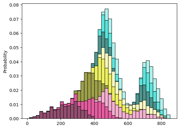
Here we are! Look at the decomposition itself with the bins.
fig, ax = plt.subplots()
ax = sd.visualization(bins=res.bins, palette=palette, ax=ax)
We can also use a boxplot.
fig, ax = plt.subplots()
ax = sd.visualization(bins=res.bins, palette=palette, kind="boxplot", ax=ax)
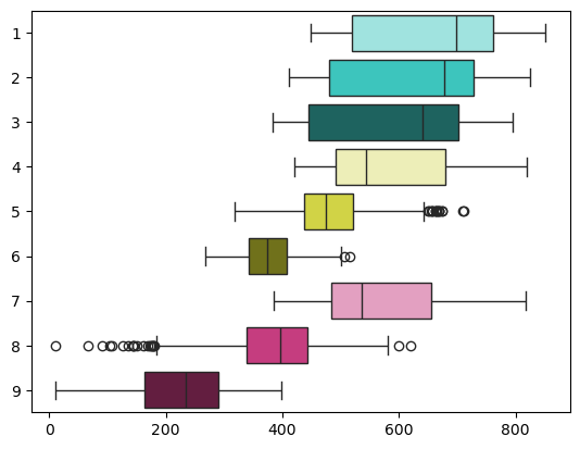
Inputs 3 and 1 have the highest sensitivity indices and thus are automatically chosen for decomposition. The most influential input 3 divides the distribution of the output into three main states with distinct colors. Input 1 further subdivides them into shades. From the graph, it becomes obvious that input 1 influences the output when input 3 is low, but has a negligible effect when input 3 is medium or high.
Finally, we can get some statistics on all states and scenarios with a table.
table, styler = sd.tableau(
    statistic=res.statistic,
    var_names=res.var_names,
    states=res.states,
    bins=res.bins,
    palette=palette,
)
styler
| N° | colour | std | min | mean | max | probability | ||
|---|---|---|---|---|---|---|---|---|
| sigma_res | R | |||||||
| low | low | 9 | 84.73 | 11.74 | 226.72 | 397.62 | 0.11 | |
| medium | 8 | 82.65 | 11.19 | 385.26 | 619.78 | 0.11 | ||
| high | 7 | 101.23 | 384.75 | 567.44 | 817.84 | 0.11 | ||
| medium | low | 6 | 43.37 | 268.77 | 376.10 | 515.25 | 0.11 | |
| medium | 5 | 63.56 | 318.15 | 485.57 | 711.72 | 0.11 | ||
| high | 4 | 106.22 | 420.61 | 580.03 | 819.41 | 0.11 | ||
| high | low | 3 | 132.84 | 383.11 | 576.80 | 794.81 | 0.11 | |
| medium | 2 | 129.07 | 410.77 | 611.25 | 824.87 | 0.11 | ||
| high | 1 | 127.28 | 448.85 | 643.91 | 851.00 | 0.11 |
Congratulations, now you know how to use SimDec to get more insights on your problem!